UI Layout:
UI Layout is essence of any UI design and lays the foundation of UI. For our game, we will be using 20 by 30 grid layout to create a pleasing UI. Using the column grid establishes the hierarchy, navigation flow, consistency, ease of use, and provides less memory load. Therefore, this layout will be the foundation of our UI design.
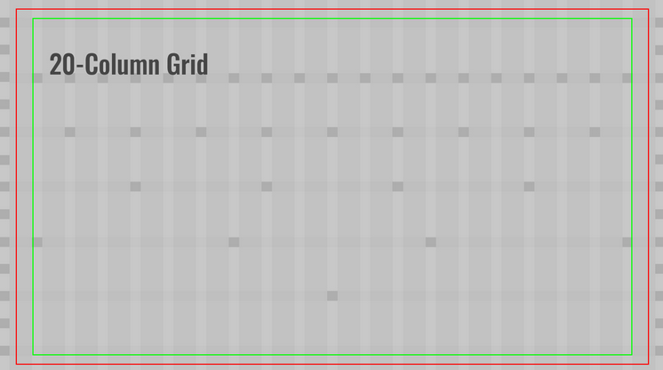
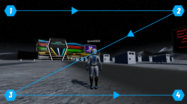
The UI Layout can be in either of the two famous types, It can either be a Z-type or a F-Type Layout.
The Z type forms a Z on the screen and it has been observed that our eyes work in a pattern while observing things, So the Z-Type suggests that the eyes will follow a Z pattern in observing information on the screen and if we place the UI / HUD in a Z pattern, it will be easier for the players to obtain the information and they would not have to put an extra effort in understanding.
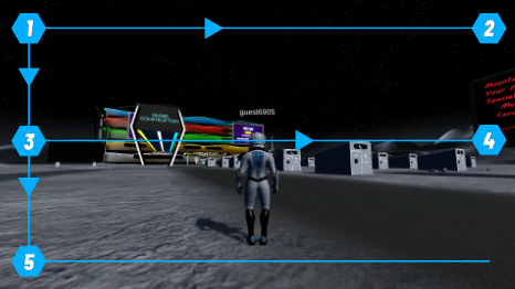
Another type is the F Layout that suggests that we follow an F pattern that’s also easier to the eyes.
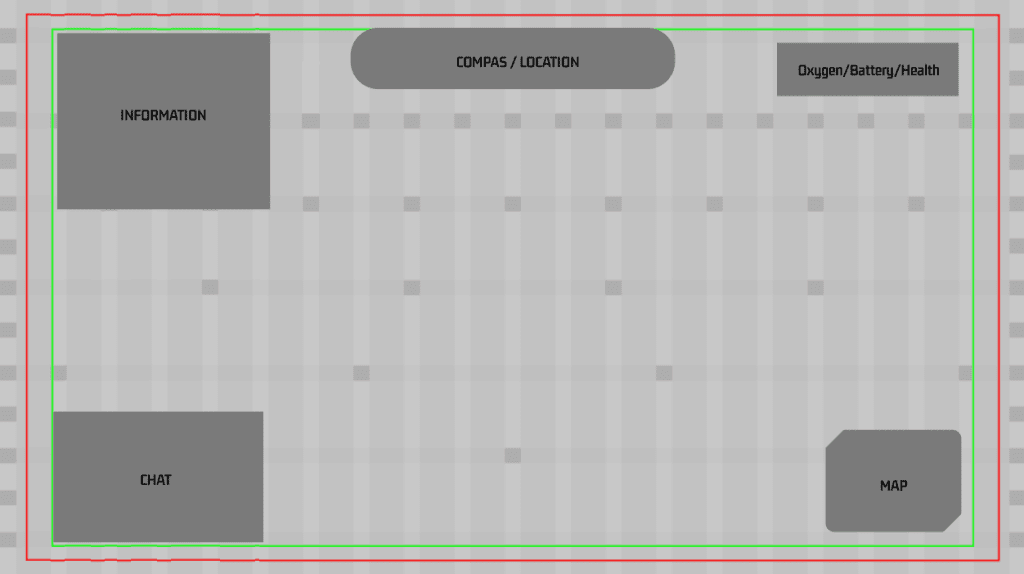
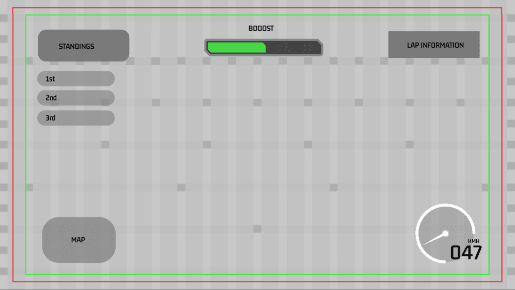
The basic structure of HUD is suggested to be somewhat like the following image, making a Z-type Layout.
Player Icon:
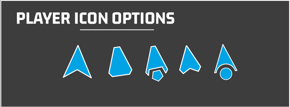
We also need to decide on the how we would like to show our player in game and cursor is just the start. This is basically how the player will be shown in minimap. Although it does not seem like a big deal but in order to create harmony within the design, the elements should be similar throughout the game. Therefore, we have to create an icon that fits perfectly with our theme.
Mockups
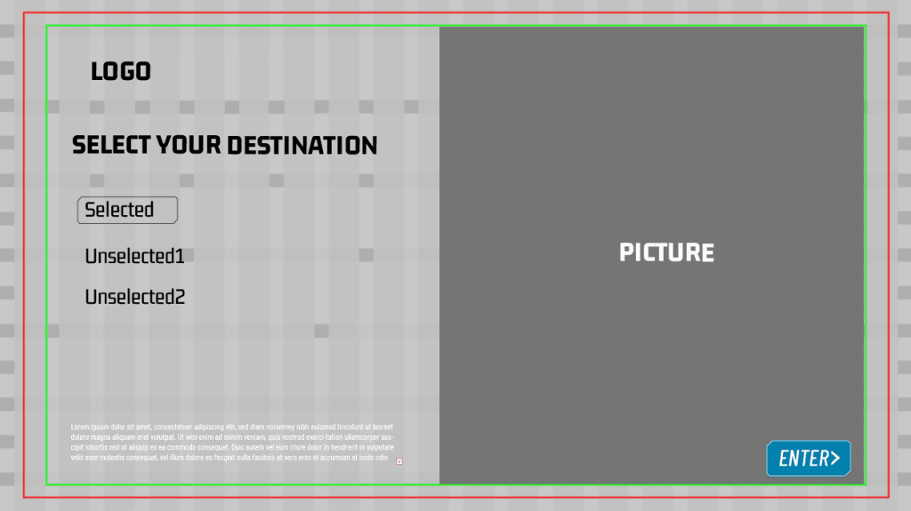
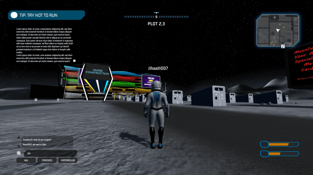
Here is a mockup of the UI, illustrating different components of the UI according to the guidelines defined above. Mockups are made to give a general idea about the Guidelines and if followed can produce great results.
Main Menu
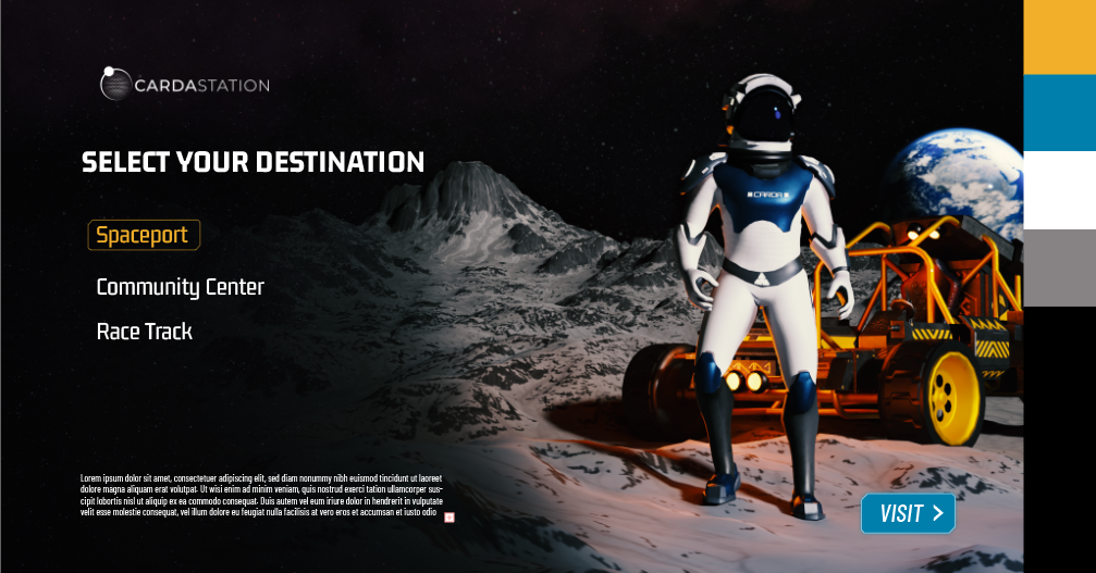
For the main menu we can follow the guidelines and keep it simple. We can have simple 2 page deep layout, which can allow players to enter their destination. This is the simplest representation of the hormony within the UI. So we can try couple of different options following the guidelines.
Loading Screen
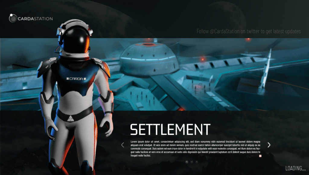
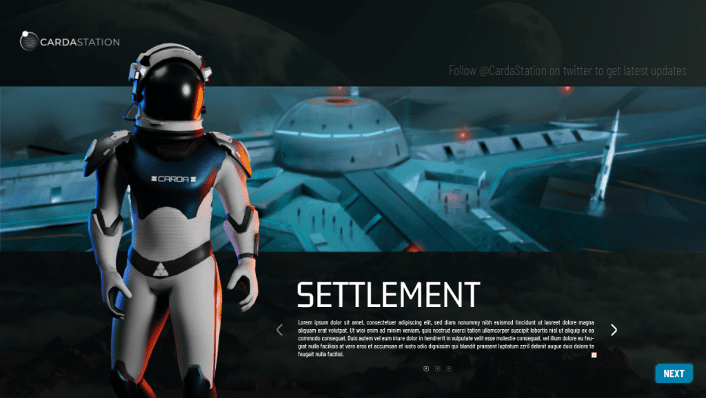
Loading screen for each scene will be different. And in the loading screen we can have multiple tips or information for the players. This can also be useful if we introduce a new feature and in the loading screen, we can provide information regarding the new feature. Once the scene is loaded, we can replace the loading icon with the “Start” or “Proceed” Button as illustrated below. This will allow enough time to the users to read and understand the information and they can start whenever they feel like. It is to be noted that the loading.. at the bottom of the screen should be animated. Either the dots are blinking or we can use the Carda loading sign. It will assist in letting the user know when the loading has completed. Once the loading has finished we can have a proceed button in its place. A more crazier thought would be to have live twitter feed at the top .
Racing:
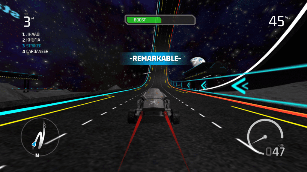
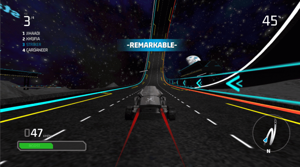
There can be two options for racing UI, Either we can put boost at the top center. Or we can put it at the bottom corner. If we put boost in the middle it’ll be more noticeable and easier for users to understand as well. However if we put the boost at the bottom corner it will draw less attention to itself. So the question is how much attention we want on boost and will it be one of the main features of the race.?

Gameplay
For the gameplay we have two options, and both can be used however we want. The first option is to have minimap at the top right corner and the healthbar, oxygen bar etc at the bottom corner and the second option is to have minimap at the bottom and info bars at the top right corner. We would be going for the 2nd option to maintain the UI structure. We need to keep UI as minimal as possible. Keep things organized and have sufficient information for the users. We can also drop the compass as well to increase minimalism as it does not serve a crucial part in the gameplay. We need to maintain font structure and colors to create a unified masterpiece.

Iconography
Icons are also an important part of visualization and helps in understanding the theme of the game. Therefore, whenever we make icons we should make them according to the theme and it is helpful to keep following things in mind when making an icon.
- Minimum screen size: Icons must be legible at the minimum size displayed.
- Simple and varied: Keep the details simple, but have enough variety to tell the icons apart.
- 1” x 1” is the maximum displayed size.
According to the defined theme of our game, following requirements have been made in order to make icons more readable and understandable yet keeping them aligned with the theme.
Requirements:
- Icon Size 100px: Mostly icon size will be corresponding to the text size but the default icon size should be 100px.
- Safe area 90px: The safe area is not more than 90px with respect to the default size
- Smallest Dot 5px: The smallest size of any element in an icon should not be less than 5px.
- Rounded Corners 1px: Corners should not be made rounded more than 1px
- Triangular shape 80px: If we are to use any triangular element in an icon, it will cover more area than the square shape and the covering area for any triangular icon should be 80px
- Square shape 75px: Square shape elemetns will occupy 75px area
- Circular shape 85: Circular element will cover the most area in order to look good enough, i.e 85px

Buttons
The border-radius is what gives buttons a lot of their personality. Sharp edge buttons look more serious, while buttons with a rounder radius look more playful. However, rounded buttons do not look good when stacked. Therefore, I suggest we make buttons sci fi by making corners edged but little rounded so it depicts playfulness yet the seriousness and provides futuristic vibes. Edges like these adds a sci-fi personality to the buttons. And it would fit perfectly with our theme. A similar profile for buttons is used in games like Crysis, Fallout and Boarderlands.

The vertical padding is the vertical space between the button outline and the text and it should be 15px in a 100px button.
The colors for buttons should follow the color pallet, there are multiple options for a button.
Primary Buttons should be a filled button, with 15px vertical padding. But depending on the button size, it may vary. The general rule should be to have half padding size as that of the font.
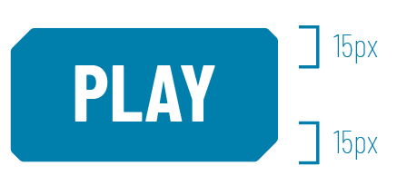
Secondary Buttons can be either filled or outline buttons but with the same dimensions.


We can also have Buttons with a glow at the back or selection indicators at the corners like shown

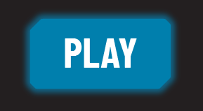

For understanding purposes, only buttons with Blue color has been illustrated but we can also use different colored buttons according to our needs that are mentioned in the color palette.
Visual Identity
Setting up the theme is the very first step of visual identity.. When it comes to a game, the theme helps in understanding the idea behind the game and makes the experience whole. So, theme is one of the most important components in any game. And since CardaStation provides a sci-fi / futuristic experience taking place in 2060. We have to create a theme that portrays futurism in its design. And to make the theme more prominent and unified, we have to setup a standard for a couple of things so that we can provide a better experience to our users. Following components are essential in making up a theme of a game.
- Colors
- Typography
- Iconography
- Buttons
- UI Layout
- Player Icon
Color Psychology:
Colors say a lot about a product than anything else. It is one of the things that our brain picks up first whenever we see anything. For a better user experience, we tend to use colors that would create a pleasing effect in the eyes of the users as well as create an impression on user’s mind. To be able to create a better experience we have to understand the product itself. And Carda Station as we know is a casual online multiplayer game that is set in the year 2060 where mankind has created a civilian base on the moon. Players can own land, assets, explore the moon and host events. Therefore, we can state that the key points of our game are “Futurism” and “Exploration”. And to create a friendly relationship between the two key points, it would make sense to use such colors that facilitates in explaining our message to our users. We therefore have, comeup with a color palette that serves our purpose and tries to help us in creating a better experience for our players.
Primary Color
A primary color is the base of the brand itself. It helps in understanding the brand and the message. Blue color serves best for our brand and explains the futuristic aspect of our game pretty well. Among multiple shades of blue, we have selected to go with a subtle shade of blue that would serve our purpose in best possible manner.
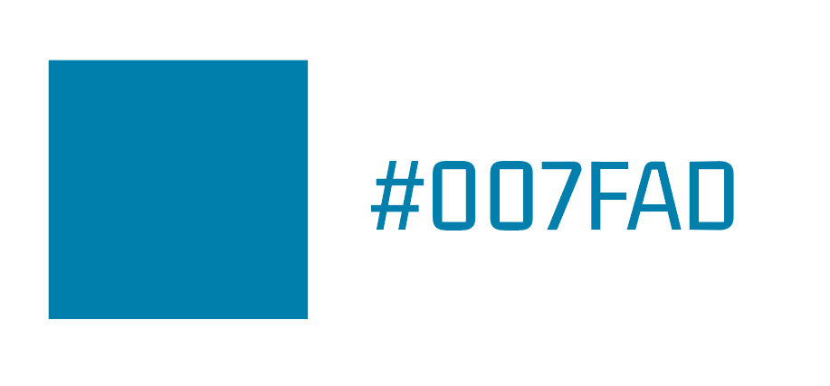
Blue color suggests following feelings whenever we see it:
Sci fi/ Calmness/ Intelligence / Relaxing / Cognitive enhancer / Peace / Comforting/ Stability / Trust
This color will be used most of the time, and can be used in icons, buttons, glow effect, text and other UI elements.
Selection
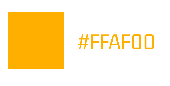
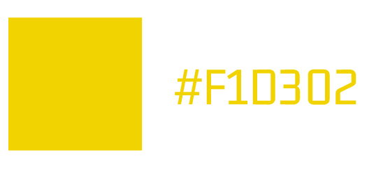
Selection color should be different from the primary color in such a way that it stands out with respect to the primary color. And what better color would be than the complementary color of the primary color for the selection. By using complementary colors, we establish the difference in such a way that its noticeable and looks good. For selection, we can use two shades of Yellow to match with our primary color. And it can be used primarily in selection and for the glow of selected icon.
Alerts!
For Alerts , we can use a red color as it is universally perceived as emergency or important element. And it is the one color that our eyes pick up first because our eyes is super sensitive to red color.
We can use this to create alerts or show negative things in our game. For example, if the health-bar goes too low, when we run out of oxygen, or if there is any danger etc.

Tertiary Color
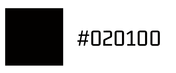
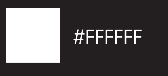
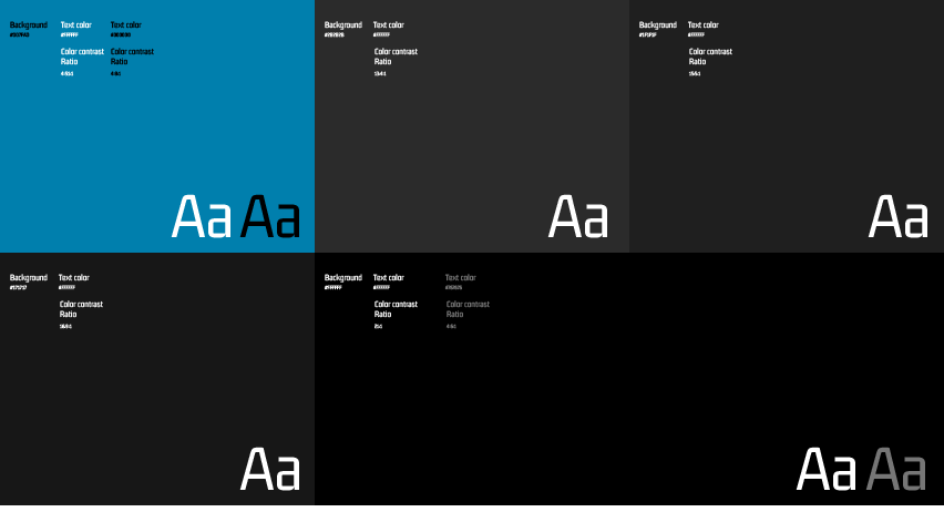
Tertiary colors are there to assist the design. And are mainly shades of white and black.
These will be used in texts, icons backgrounds etc just to make our brand colors stand out more.

Typography
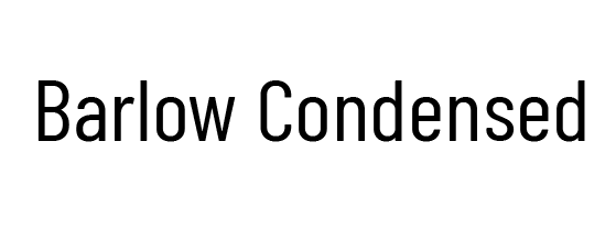
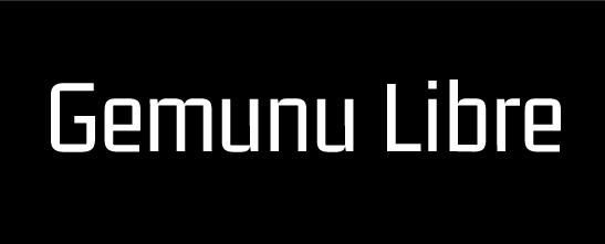
Fonts define the mood and helps in defining the theme. However, those fonts should be selected that are easily understandable and serves the theme right. For our Game, two of the following fonts are decided that serves our theme quite well. There are 2 fonts that will be used throughout the game. These fonts are easily readable as they are illustrator below. Primary font serves as the text that is easily readable and second font helps in explaining the theme of the brand. Following fonts are selected for CardaStation.

PRIMARY FONT:

SECONDARY FONT

Sidenote: Thank you for going through this document. If you have any suggestions, or feedback, do write to me, I will update it. And the Guidelines will improve and update as needed with time.
All artwork and images on this site are the exclusive property of Wahab Ahmad and are protected under the United States and International Copyright laws. The images may not be reproduced, copied, transmitted, or manipulated without the written permission of Wahab Ahmad. All rights reserved.
